Workshop Spotlight
By Meredith Klein, MƒA Master Teacher
Data visualization and dumplings were enough to lure me to my very first MƒA Thursday Think, but I was engaged by data journalist Mona Chalabi immediately – she is a charismatic and self-deprecating speaker, someone who seems like they could be fun to get coffee with. Mona opened with a list of irresistible data sets: affirmative action, left-handed people, the wage gap, cervical dilation, nepotism, third nipples, the red fox population, yoga, and more. Later, she projected a slide of thumbnails of her work which she belatedly realized featured many, shall we say, body parts not usually exhibited at a Thursday Think. Immediately, my greatest regret was learning too late that she had co-facilitated an MƒA mini-course just last semester.
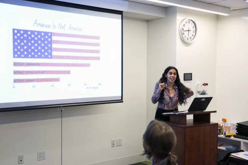
At the February MƒA Thursday Think, Mona’s talk took the audience through her process for creating data visualizations. As she clicked past her first slide, I was elated by an unexpected detail: her images are hand-drawn. This resonated with me, as someone who has studied both art and mathematics and knows the benefits of an interdisciplinary toolbox. Mona Chalabi is not just a data journalist with work published at The Guardian and FiveThirtyEight, but also an artist, a designer, an activist, a bit of a historian, and sort of an Instagram celebrity.
Mona comes to a final image through a non-linear process with one of four starting points, but with consideration for all four along the way: An Issue, A Dataset, The Design, The Audience. Looking at one of her completed images, you experience exactly what she says makes a data visualization successful. Although she concedes that objectivity may be important when representing data in other contexts, Mona says that a successful image should not take more than a few seconds to be felt and understood. A very strong case in point: Mona’s pie chart representing the proportion of adults that have experienced rectal bleeding. Use your imagination or Google.
Using Instagram, animation, and humorous or poignant imagery, Mona reaches a wide audience. She is aware that the data sets to which she is often drawn lay bare her liberal politics (immigration, gender, feminism, incarcerated people’s rights, bodies), but many of her pieces are of interest to anyone (she offered examples like “how much pee is too much pee?”) and may expose someone to a perspective that they would not have sought out on their own.
One of the very few females working in her field, she knows that her work has been at times dismissed as being “cute,” which is the experience of many female artists who create with their hands or use craft or non-traditional media. However, Mona’s work is highly accurate, effective, and affective as is evident in her work itself, her resume, and her nearly 35K Instagram followers. Her goal is engagement and inclusivity, and her various media platforms afford a rare interactive opportunity to involve followers in her creative process, rather than asking them to blindly trust her representations. I was reminded of an analogy that MƒA course facilitator Ben Blum-Smith used in a mini-course a few years back called “Irrationality” that has deeply influenced my own pedagogy: algorithms are so often handed down as if they are keys to mysterious doors. But, someone had to build that door in order to create that key. The opportunity to break the door apart and see how the locking mechanism works validates and ultimately satisfies skepticism.
Mona’s images are able to do things that computer-generated visualizations are not. Her job as a journalist is to make sure that readers understand the data and come away with an accurate sense of it, which is not, for example, the case during pre-election reporting. Her analogy: How do we interpret and respond to reports of a 30 percent chance of rain versus a 30 percent chance of a candidate winning an election? And, she asked, what value does this projection hold for democracy when it is reported before people have even voted? Data journalists must effectively represent uncertainty so that we can interpret polling numbers the way we do a weather forecast.
In her own words, Mona said: “It has been so brilliant getting to know the teachers at MƒA. The mini-course that I developed with Master Teacher Ellie Vierling really showed me the potential (and pitfalls) of trying to get students to engage with my work, and I look forward to sharing more classroom-ready datasets.” Mona also recently wrote a piece that appeared in The Guardian that hints at some of the work MƒA and Mona are doing together for students and classrooms.
I encourage everyone to follow Mona Chalabi on Instagram (as I did at minute five of her talk), watch the recording of her talk on MƒA’s Facebook page, and to think about trying something like what she suggested, with students: offer five or so irresistible data sets for them to choose from, and play around with its representations. Have them start in Google Sheets, look for shapes and patterns that might lend themselves to a compelling image, think about a target audience and the feelings they want to elicit. Ask why some data is collected and some isn’t. Learn that datasets hold truth, are accessible, and wide-ranging beyond imagination. Being in the data driver’s seat could be very empowering and creatively satisfying for our students as young media consumers with their own curiosities, opinions, and anxieties.

Meredith Klein began her teaching career as an MƒA Fellow in 2009 and has continued on as a two-time MƒA Master Teacher. She teaches project-based math at International High School at Union Square, a school for new immigrants from over thirty countries. Meredith has been featured in Bicycling Magazine, WNYC, and Outside Magazine for her work in bike education for youth and adults. She has written curriculum and regularly facilitates workshops on project-based mathematics and supporting content area writing for ELLs.